
I chose to
focus on Victoria’s Secret marketing
campaign. Victoria's Secret is an
American retailer of
women's wear, lingerie
and beauty products that is internationally known. Victoria's
Secret was established in San Francisco during the early 1970's by Roy Raymond.
The concept was to establish a cozy, inviting atmosphere similar to that of a
victorian boudouir. Today, Victoria's Secret lingerie is the top performer for
the congolomerate. Victoria's Secret, under Limited Brands, has a history of
being sexy, youthful and romantic. Men and women have come to recognize
Victoria's Secret as the place to buy a lingerie gift.
The logo is
very simple and modern it is a typeface type of logo that was created and
designed by Andreu Balius. A custom
typeface designed for display purposes. Based on Carmen display, as required,
it has been designed in order to enhance the sexy appeal of letters. It
includes a large number of swashes and ligatures to complete the sexy set. The
logo is very simple and they company uses it on different backgrounds depending
on the packaging. The logo is simply the words “Victoria’s Secret “ in black color.
The advertisement is very rich and modern, mostly they use TV commercials
but recently they have been creating annual shows that display some of their
expensive lingerie designs and the faces of the company that they call their
“Angels” which are the models. Their angels are one way of advertisement
because everywhere they are seen they are associated with Victoria’s Secret
products. Most of their commercials are available online and clips of their
annual shows are also easily found on the web for their customers to see.


The company provides online shopping as well, because many countries
don’t have Victoria’s Secret stores. The web site displays many things that
they don’t provide in stores such as cloths, shoes and handbags as well as
their famous well-known lingerie and beauty products. The color scheme, which
is black, pink and white is also consistent in stores and on their web site.


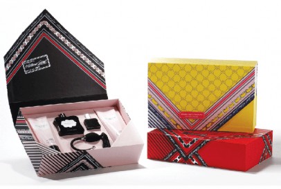
Victoria’s Secret packaging is very trendy and unique, because every
product has a way that it is packed. The brand has unity while they create
their boxes or bags because they use the color pink to associate it with the
female gender. A bright pink bag says VICTORIA’S SECRET from feet away. I
believe that their packaging today became more feminine and edgy where years ago
they used boxes and shopping bags that were sophisticated and classic.


Links:
I really enjoyed your post. Victoria's Secret is a very well known and popular brand and to see how they came about with creating the logo for the brand was definitely interesting. The colors and the typeface work perfectly for the message they're sending to consumers.
ReplyDelete