Print 1
Kinkos Series Brochures
Print is defined as the production of text or an image
by applying inked types, plates, blocks, or the like, to paper or other
material either by direct pressure or indirectly by offsetting an image onto an
intermediate roller. I have chosen as an example to show a series of brochures
for a company that focuses on printing in its different ways. Kinko’s is a
branch of Fedex that focuses on traditional
full-service copy and print shop services. The three brochures are focused on (Environmental Commitment,
Print Online and Signs & Graphics). All of the brochures carry the headline and body text aligned
left justified using a sans
serif typeface and all letters are uppercased to emphasize on the purpose of
the information that the brochure carry’s inside. The type is displayed by
using the color blue, which is mostly used for communication and has the
meaning of trustworthy,
dependable, and committed.
Print 2
Bloomingdales
Bloomingdales is an
upscale American
department store that
first opened in New York City in 1861 and there is 45 stores in the nation. They
sell products such as Clothing, footwear, bedding, furniture,
jewelry, beauty products and house wares. They also have different retails inside
the department stores such as optical, salon, portrait studio and cafe.
(Cover)
The first
printed piece is the cover of the May 2011 catalog it can be recognized where
the logo (Bloomingdale's) is placed in the bottom of the page. The catalog
mainly focused on the Family & Friends sale that they have through out the
year and chose to do it last year on mother’s day, which is an important family
day. The cover has many type manipulations in using the word (Mom) where
they designed the cover in blocks. The first block carries the letter (M),
which is the biggest in size and is typed in a serif font. The second block is
the (Sun May) on the left side which is the first Sunday of May (Mothers Day),
the words are centered and Sun is smaller than May and a mix of serif and san
serif type is used together. The third block is on the right and carries the
letter (O), which is also serif and centered. The fourth block carries the
number 8 which is the day of the sale and the holiday, the number is centered
and in a large point size to be recognized. The fifth and last block carries
the letter (M), which spells out the word (mom) and three dots that indicate
the end of the concept of the cover and sale.
(Direct Mailer)
This mailer is the extra
coupon that can be given to any friend to use in the store or online for 20%
off. The logo of Bloomingdale’s is located in the bottom of the card.
Everything is centered and divided into 4 parts (the headline, date,
information and contact). The headline san serif and centered and typed in a
large point size to emphasis the concept of the mailer. The second part is the
dates of the sale that are typed in san serif and displayed in a purple color.
The information section is also centered and san serif, the headlines are displayed
in purple and the info in black. The last section carries the logo and the web
site of the brand to shop. The color purple is used mainly in this piece
because it calls
to mind opulence and royalty, it
has sense of mystic and
royal qualities, purple is a color often well liked by very creative or
eccentric types and is the favorite color of adolescent girls.
Print 3
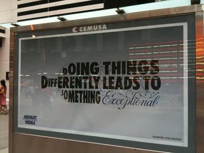
Absolute creativeness
Type is rarely used in advertisement because many
designers fear that the message will not be conveyed clearly or that it wont be
clear enough for viewers to establish that its sending a message. However
designers that work on Absolute Vodka campaigns took the chance to challenge
that approach when they chose to designer the bottle shape out of type. They
used the type attack very wise and creative. By taking the new
approach in designing the iconic bottle shape they portrayed how unique and fun
their brand is. Their audience really enjoyed the new twist and they continued
to design in this direction with even stronger lines.
(Print Ad)
This specific piece defines the term type attack indeed, where the designer used two different typefaces (san serif and script) to create the outlines of a bottle vertically. Color is also used but is not as a strong design element as the lines are used in the layout.
(Digital Ad)
This is also an ad by absolute vodka that uses the same concept of selling their product. However this ad was designed horizontally and uses the san serif type face more than the script typeface. This ad also shows the lines that keep the layout of the letters in place. i velieve that this ad is more affective because it is bolder and I can imagine this specific bottle being thrown in to the ocean with out getting apart. I think that these designs are very unique and creative.


No comments:
Post a Comment